- An A4 music magazine advertisement for the release of a new single.
- A website for the band.
- A digipack for the single.
I started to research other artists' album covers from the same genre of music. My album needed to reflect the conventions of the alternative/art indie music scene.
With the strong haunting vocals over the top of the track I started by doing research into albums from female singer/songwriters in the alternative pop genre whose music was similar.
Bat for Lashes- The art work is very fantastical, the artist is framed in the middle of the shot in costume with a mythological theme present. The costume intergrates her into this mythological world.The different aspects to the background are layered on with the candles and trees almost merging into the water coloured painted blue scenery.

 The album cover for Florence and the machine is similar with a decorated photo of the artist absorbed in scenery taking the main focus of the cover. The artists name is also at the top but on a black border. I like the literal reference to the title 'lungs' within the image as well. Your focus is drawn to it as well with the central writing of the album name. This is different ot bats for lashes were it is intergrated into background.
Obviously there is a wide range of different looks of album covers even within this genre but what seems key and was a recurring theme, is having the prescence of the artist in it. After all you are not only trying to sell the album but also the artist, for a listener to build a relationship to the music the identity of the artist must be presented.

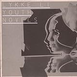

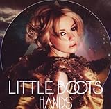
The colour palette used in these albums are all fairly narrow and fits into the non-glossy look associated with the alternative genre.The aim seems to be to create something artistic as opposed to showy. Little Boots is closest of these artists to mainstream pop and this is reflected in the cover for her album hands. The album covers which appealed most to me were the ones that had a more DIY look to them. Lykke Li's paper collage or Ladyhawke's water colour sketch. The visibility of materials being applied appealed to me and the idea of using different textures was something that I wanted to intergrate into my digipack.
Anna Calvi's Digipack for her debut album


I really liked the use of the necklace to act as a font for the writing throughout. Not only spelling out the name of the artist but the track listings as well. Taking this idea I wondered if the red ribbon, central to my music video could be used in much a similar way to the necklace. The danger of this might be ribbon overload though as our digipacks potentially have to be for an album as opposed to just the single of the music video track. The ribbon imagery is part of the visual identity of the music video and that one track, it is unusual for that identity to completely dominate the artwork for the whole album.
I looked for examples of where artists had taken inspiration from one of their music videos for the imagery on their album cover.


 The White Stripes are a band who understand the importance of image identity. They have a certain colour palette that has become unique to them. The strong red and black are colours that are recurrent in any visual products the band put out. However this is motif is not simply connected to one song or music video, it is a recurrent factor and would be hard to compare to my idea behind re-using the ribbon.


Moving closer to the idea of imagery/motifs being used in both album artwork and music video it seemed the concept albums were the best examples of using this.

 Arcade Fire-The Suburbs
Released last year this concept album is inspired by the band's upbringing in the suburbs of Houston and according to frontman Win Butler “is neither a love letter to, nor an indictment of, the suburbs – it's a letter from the suburbs.” A Short film called 'Scenes from the Suburbs' directed by Spike Jonze accompanied the album.

Coldplay-Viva La Vida or Death and all his friends

<
The problem with following the concept album model as a point of validation for using my ribbon as central to my album artwork as well as my video is that it takes in the bigger themes of setting in place and time that encapsulates the whole of the mise en scene. Whereas my idea of using the red ribbon as a way to tell the narrative of a love story is something that seems conclusive to that one track alone.
I was also having problems finding examples of the D.I.Y style of album cover that I thought could work for the ribbon idea. Part of me thought that the sense of 'home made' art would be something that appealed to artists of alternative music in that hipster way of everything having to look bohemian and un-polished but it seemed that the general wave of focus was more on presenting imagery as opposed to texture.
 |
| Having filmed the band in vintage style clothing that evoked pre-war glamour I liked the idea of incorporating that look into the digipack. The sepia toned colours and old fashioned film reel quality to this album by Beirut |
 |
| I like the DIY layering of the titles and photos of the artists onto the red background and i imagine much the same with framed photos of the band and ribbon. |
 |
| I like the idea of the digipack potentially trying to be disguised as something else. Here the characteristic crocodile skin textured background helps in presenting the album as a board game. |
 |
| This is the closest i could find to band members being framed in separate positions on an album cover. Although it's a bit plain, the white bordering around each photo with it appearing like a film strip is quite effective at giving not only a sense of the energy of their music but also the space to identify the dynamic between them as a band. |
No comments:
Post a Comment